1. Tour De France Logo
Unarguably the biggest event in cycling, Tour de France logo is a tribute to the sport. On the face of it, it’s just letters in irregular fonts spelling out what we already know, but the key to discovering the hidden message is by focusing on the word “tour”.
This iconic logo was introduced in 2003 to commemorate 100 years, the “O” in tour stands for the back wheel of the bicycle while the yellow circle represents the front wheel and yellow jerseys worn by winners of each stage of the race. The “R” is transformed to look like a rider.
2. Baskin Robbins Logo
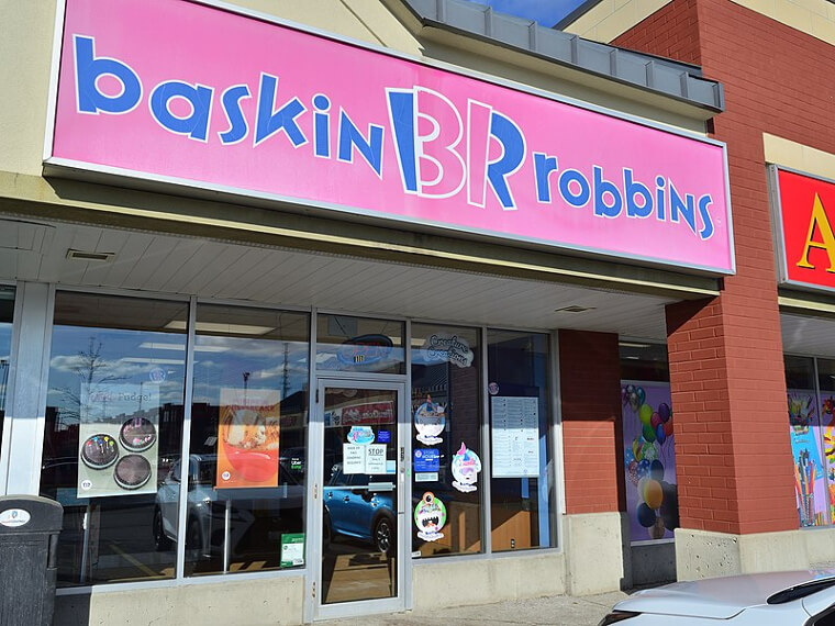
Baskin Robbins logo is fun to look at, catchy in appearance with colors and fonts which make it look like a kid’s Fine Art homework. You will be surprised to discover there is more to it than all that. If you look closely, you will discover something – the pink isn’t just there to add more color to the logo, it emphasizes the figure 31.
The number ‘31’ represents the number of original flavors that the ice cream company started with in 1948. It was the first ice cream shop to introduce sampling before buying. To this day, Baskin Robbins still pays homage to the original 31.
3. Toyota Logo
Car logos are not without their own hidden meanings too, and the logo of Toyota will show you that. According to official sources, the three ellipses on the logo represent “the unification of the heart of our customers and the heart of Toyota products” while the white space in the background symbolizes “Toyota’s technological advancement and boundless opportunities ahead.”
However, this is not the only explanation for the logo. Some people believe the logo looks like a thread passing through the eye of a needle and this is to symbolize Toyota’s beginning in the textile industry. Find a more symbolic message in the next post.
4. Amazon Logo
You can find anything on Amazon and this company wants you to know that once you look at the logo. A simple and effective logo with an arrow moving from A to Z is not a coincidence at all.
Amazon logo wasn’t always like this, the first logo that was used when Jeff Bezos started in 1994 was nothing compared to this in terms of creativity, as the company expanded their products and began offering other things apart from books, the logo was modified. It was not until the year 2000 that they started using this one.
5. FedEx Logo
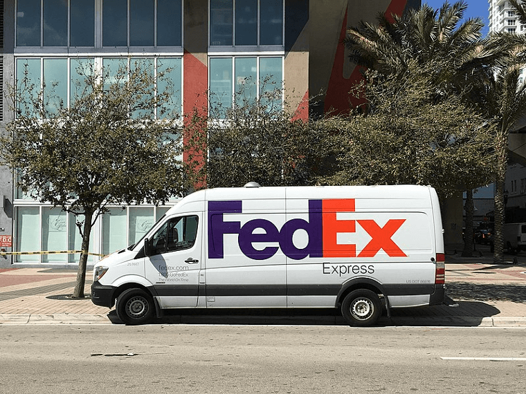
FedEx logo is a definition of simple yet ingenious, a capitalization on the negative space between “E” and “x” to create an arrow which points right or forward. The courier service company is a household name everywhere.
It is said that the arrow represents speed and accuracy, a message any courier service company will want to pass across to its customers. Although the company was founded in 1971, it wasn’t until 1996 that this symbolic logo was created.
6. Pittsburgh Zoo Logo
Pittsburgh Zoo logo is an amazing work of art. In simple colors of white and black, this is a logo with more than one secret hidden within. At first glance, it’s just another tree with birds flying at the top. But look closer.
Have you seen the lion and gorilla staring into each other’s faces in the negative space around the tree? If you saw that, did you see the fishes leaping out of what looks like a stream at the root of the tree? You cannot but give credit to whoever created this.
7. Hershey's Kisses Logo
If you are looking for a hidden message in any logo, your best bet is to look into the negative space. The logo of Hershey’s Kisses confirms that, but you may be too focused on eating the cookies to notice.
The logo of their Hershey’s Kisses cookies is such that the “K” and the “I” meet to form the shape of one their chocolate kisses with the negative space in between them. While this logo is a recent development, it matches the shape of a Hershey kiss which hasn’t changed since 1907.
8. BMW Logo
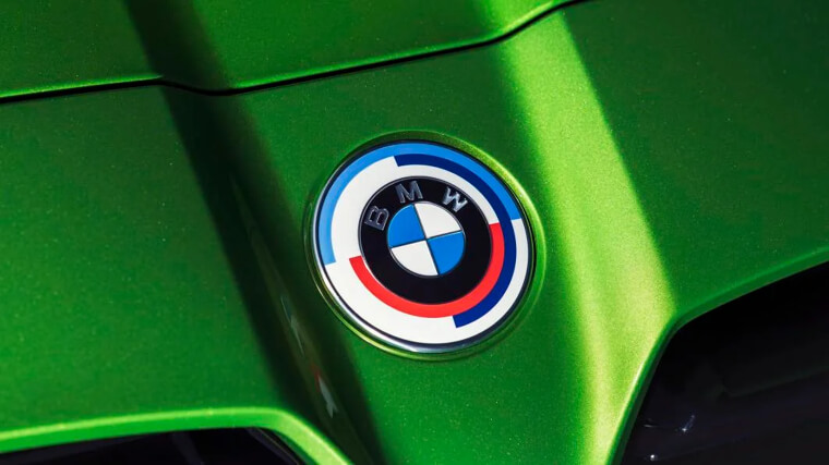
There are two varying opinions on what the blue and white on the logo of BMW truly represents. The enduring belief is that it represents a propeller due to the origin of the company as an engine manufacturer after the first World War.
Not everyone agrees with this, there is another opinion that the blue and white represents a tribute to the flag of Bavaria where the company started. Either way, the two theories appear to have a certain validity to them and definitely gives the customer something to think about.
9. LG Logo
The logo of LG Electronics appears to be a winking emoji face at first glance. On a closer look, you will discover that G is the outline of the face while L represents the nose.
According to some fans, LG’s logo resembles a modified Pacman.
10. A Lookout Atop The Statue of Liberty
Imagine standing in the balcony holding a torch, on the statue of liberty. The glorious feeling of looking at the vast space around you.
Many people have had this chance in the past when there was a staircase leading to the place. However, it was destroyed in 1916 by an explosion but later replaced in 1986.
11. Delta Airlines Logo
The ingenuity in Delta airlines logo is in the shape of the logo which forms the symbol of the fourth letter of the Greek alphabet – Delta. The white lines within the logo also represent the wings of an airplane, symbolically the DC-8, Delta's first jet aircraft.
The Delta symbol is also a reference to the roots of the airline in the Mississippi Delta region.
12. Pay For One, Get One Free
Next time you buy a charger with USB port, try and check to confirm if it is what it says it is. One would have thought that the double USB port is an advantage, but this manufacturer thinks otherwise.
Here they are, hiding the second port and making us wonder whether it is cheaper to make two and hide one instead of making just one.
13. Mickey Mouse From The Skies
Sometimes, you need to go up to see the world better. Here is a picture of a grass spot of Mickey Mouse taken from the airplane.
From up there, it looks like a dirty patch on a tile floor. Whereas, it has a painstakingly groomed field of grass.
14. Happy Bear In The Mountain
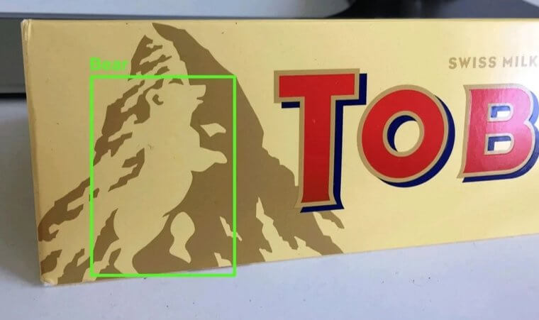
The next time you are enjoying a bite of Toblerone chocolate, take a look at the logo.
We can imagine your surprise when you get to discover a bear inside the mountain image on your favorite chocolate cookie, you didn’t see that coming, did you?
15. Camera-Flage
Thinking of hiding a surveillance camera in plain sight? This company just made a breakthrough in that.
Disguising the security camera as a brick is a definite way to prevent thieves and burglars from noticing they are being watched. The police could learn a thing or two from this.
16. Goodwill Logo
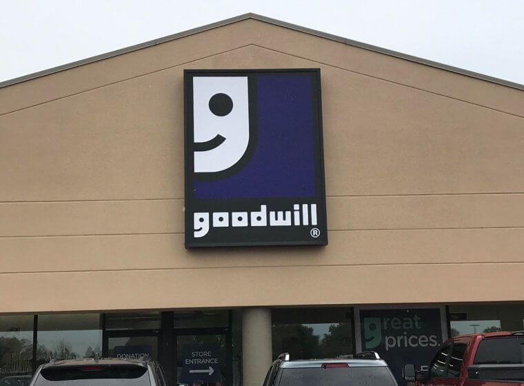
The smiling half-face on the Goodwill logo is familiar to most people who have donated or bought second-hand products, but not everyone can recognize the symbolism in this.
The fact that the ‘G’ in Goodwill is the same smiling half-face on the logo but with a different color background. Hiding the logo among the text is a clever way of proving that the message is not always in the image.
17. Phillip Morris Trademark
Phillip Morris cigarettes want to be recognized, even if all you have is a stick of it or a stub. The image of a man with his dog which is on the packet of the cigarette is also placed at the butt end for you to see.
The only thing is you have to pay close attention in order to notice it.
18. No Pets Allowed
When the school made the rule that pets are not allowed in class, they definitely didn’t have a lamb in mind. They were probably thinking of cats, dogs or a sassy parrot. Someone here decided to up the ante and god knows the trouble he or she may run into if discovered.
So far, the lamb is being a lamb, but who knows what will happen before school closes, someone might end up in detention.
19. Find The Phone
How long did you stare at this picture before you finally spotted the elusive phone? Maybe you’re still looking. It took us a while too especially when the phone and the rug appear to share the same patterned design.
By now you should have found the phone but if you haven’t, it is right next to the front right leg of the table.
20. The Coca-Cola Door
Everyone likes Exclusivity and this sandwich shop known as The Press in Shanghai, China creates its own exclusive bar in style. The entrance to the private bar is hidden with a Coca-Cola vending machine that serves as a door.
You only have open the machine to discover a whole new place, we assume this place is reserved for the royalty among its revelers.
21. Gillette Logo
Think of Gillette razor and its sharpness, the logo embodies this.
In a simple yet effective way, the logo subtly makes reference to the razor with the negative space in ‘G’ and the ‘I’ which resembles the shape of razors.
22. The Paradox of Time Square
Times Square is one of the busiest places in the world, with the biggest companies in the world competing for commuters’ attention with their adverts.
Despite the hustle and bustle of this place, the classic building in the square known as One Times Square is completely empty. The building was bought by an advertising agency in 1992 when the company that owned the building went bankrupt.
23. The Transparent Lake
Does it look like someone is laying on Aladdin’s carpet? No, she is not. She is actually floating on one of the most beautiful lakes in the world. This lake in Glacier National Park Montana is so transparent that you may not notice the water.
It is a very spectacular spot for relaxation and you can just float on the water feeling weightless and without worries.
24. The Secret Door
A secret passage is a delight to stumble upon, sometimes, it seems you can only find those in movies and people only use them to stash guns and drugs.
But in Admont Abbey Library in Austria, there is a hidden room with a bookshelf as its door. We wonder what is stored inside there, but since it is a library, our guess is more books.
25. Robo-Scarf
There are robots hidden on this scarf, and if you look well enough you will find them.
The robots form a pattern on the scarf and it is a wonderful gift to keep your significant other warm during the winter months.


